Every Sunday night I write a to-do list for the coming week, and every week I get through about half of the tasks on it, if I’m lucky.
In the last couple of months I’ve started to make the list a bit more realistic on Monday morning, by adding symbols which indicate the likelihood I’ll get to that task.
This is my system, and it’s genuinely increased my productivity.
First 2 sets of photos: PETG thermoplastic heat-shaped. LED berry lights. Diffused light with tracing paper and sanding the plastic. Tutorial:http://www.therpf.com/f9/magic-power-prop-tutorial-233092/ 3rd set: Heat-shaped PETG strips to form a half-sphere structure to support organza, all attached together by tape. The most vivid sheen swirls in the bottom left photo were created by a torch. Last photo: Comparison of 2 different types of organza fabric. Type on the left was used in the 3rd set of photos, I later found a better organza with a more vivid sheen (it was labelled ‘dance organza’).
Ah yes, hands are notoriously difficult to draw. I’ll do what I can to help!
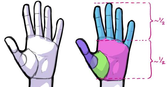
First off, below is a diagram of how I usually invision the shapes that make up the hand. Proportion-wise, the longest finger is usually just a little bit shorter than the palm (though this can vary from person to person).
Here’s the hand again, in a different position. Sometimes I find it helpful to think of the segments of the finger as box-like shapes, rather than cylinders.
Here’s a breakdown of my usual process while drawing hands:
Honestly, while I know it’s not the answer anyone wants to hear, the things that will help more than anything else are lots of practice and using references. On the plus side, the good thing about hands is that references are easy to find! Besides looking at your own hands for reference (which I definitely recommend), you can also look up images online. The website Pixlovely even has a drawing practice tool specifically for hands.
Okay, I will be going into more detail about the various parts of the body later, but this seemed like a good opportunity to start off with an overview.
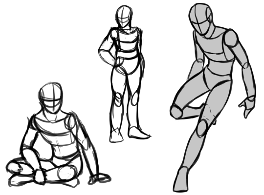
In drawing, it is generally better to start with basic shapes, before jumping right into doing all the details. That’s why many artists use a skeleton or mannequin of sorts to lay out the general shape of the body before they start on the face, hair, clothing, and so on. Different artist’s mannequins tend to look a little different, and I don’t think there’s one “right” way to do it, but here’s what mine look like:
At this early stage in a drawing, the most important things are the pose and the proportions. I’ll talk about posing in a later post, but here are my thoughts about proportions:
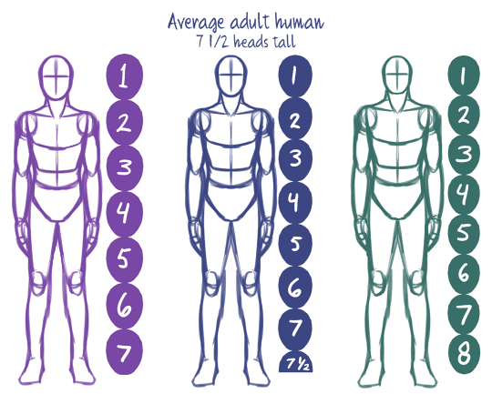
When talking about proportions, we often measure in “heads” – that is, the height of the head of the person being measured. The average adult human is roughly seven and a half heads tall, although there is some variation in real life (and even more variation in stylized art!).
Characters with larger heads in proportion to their bodies (in other words, characters who are fewer heads tall) tend to look younger and/or cuter (hence, chibis).
Conversely, characters with a smaller head in proportion to their bodies (characters who are more heads tall) tend to look powerful or imposing. You’ll see this a lot with superheroes and villains and other “larger-than-life” characters.
Keeping the various parts of the body in proportion to each other can be a challenge. Here are some of the rules-of-thumb I use to help keep things from getting too wonky:
The legs are roughly half the total height
Elbows fall at or just below the bottom of the rib cage
Wrists are even with the crotch
The length of the hand, from the heel of the palm to the tip of the longest finger, is roughly equal to the height of the face, from chin to hairline
Okay, finally getting around to those art questions (sorry for the wait!). Keep in mind, my word is not absolute – being an artist is a constant state of learning, and that applies to me too! But I’m happy to share my thoughts, and link to other resources if I think they may be helpful 🙂
The first question is about dragons:
When drawing dragons, I usually start with a blocky wedge shape as the basis of the head. This helps with visualizing the head in perspective.
(I’ve seen other artists use different shapes for this – it comes down to personal preference, really.)
Altering the initial shape of wedge and the placement of the facial features within it can help you create different head shapes for your dragons:
One of the tricky things about the ¾ view in particular is trying to keep the face symmetrical as the head turns. This is one of the reasons I find the wedge helpful as a guideline. In the example below, this dragon’s eye falls halfway between the front and back of the box in the sideview. Drawing a halfway line on the box in perspective helps place the eyes in the ¾ view.


